  survived pclass    sex age    fare    embarked
1    FALSE  Third   male  22  7.2500 Southampton
2     TRUE  First female  38 71.2833   Cherbourg
3     TRUE  Third female  26  7.9250 Southampton
4     TRUE  First female  35 53.1000 Southampton
5    FALSE  Third   male  35  8.0500 Southampton
6 FALSE Third male NA 8.4583 QueenstownVisualizing Data with ggplot
Prerequisites
Data
Data
    survived pclass    sex age   fare    embarked
886    FALSE  Third female  39 29.125  Queenstown
887    FALSE Second   male  27 13.000 Southampton
888     TRUE  First female  19 30.000 Southampton
889    FALSE  Third female  NA 23.450 Southampton
890     TRUE  First   male  26 30.000   Cherbourg
891    FALSE  Third   male  32  7.750  Queenstown
Data
Rows: 891
Columns: 6
$ survived <lgl> FALSE, TRUE, TRUE, TRUE, FALSE, FALSE, FALSE, FALSE, TRUE, TR…
$ pclass   <chr> "Third", "First", "Third", "First", "Third", "Third", "First"…
$ sex      <fct> male, female, female, female, male, male, male, male, female,…
$ age      <dbl> 22, 38, 26, 35, 35, NA, 54, 2, 27, 14, 4, 58, 20, 39, 14, 55,…
$ fare     <dbl> 7.2500, 71.2833, 7.9250, 53.1000, 8.0500, 8.4583, 51.8625, 21…
$ embarked <fct> Southampton, Cherbourg, Southampton, Southampton, Southampton…
Visuals with a Single Categorical Variable
If you could speak to R in English, how would you tell R to make this plot for you?
OR
If you had the data and had to draw this bar plot by hand, what would you do?

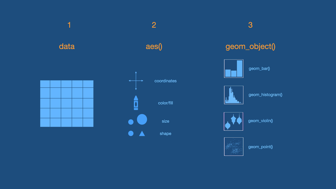
3 Steps of Making a Basic ggplot
1.Pick data
2.Map data onto aesthetics
3.Add the geometric layer
Step 1 - Pick Data
Step 2 - Map Data to Aesthetics
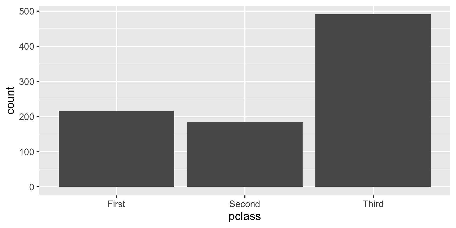
Step 3 - Add the Geometric Layer
Visualizing a Single Numeric Variable
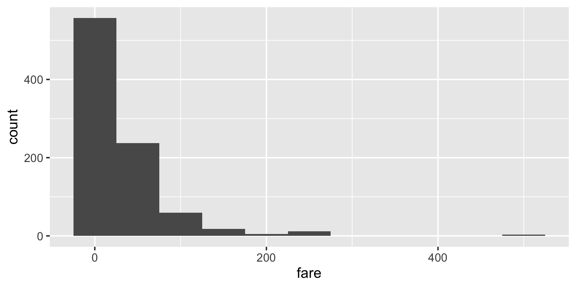
What is this warning?
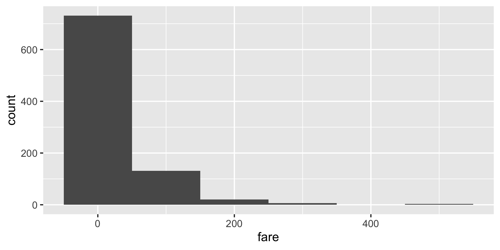
`stat_bin()` using `bins = 30`. Pick better value with `binwidth`.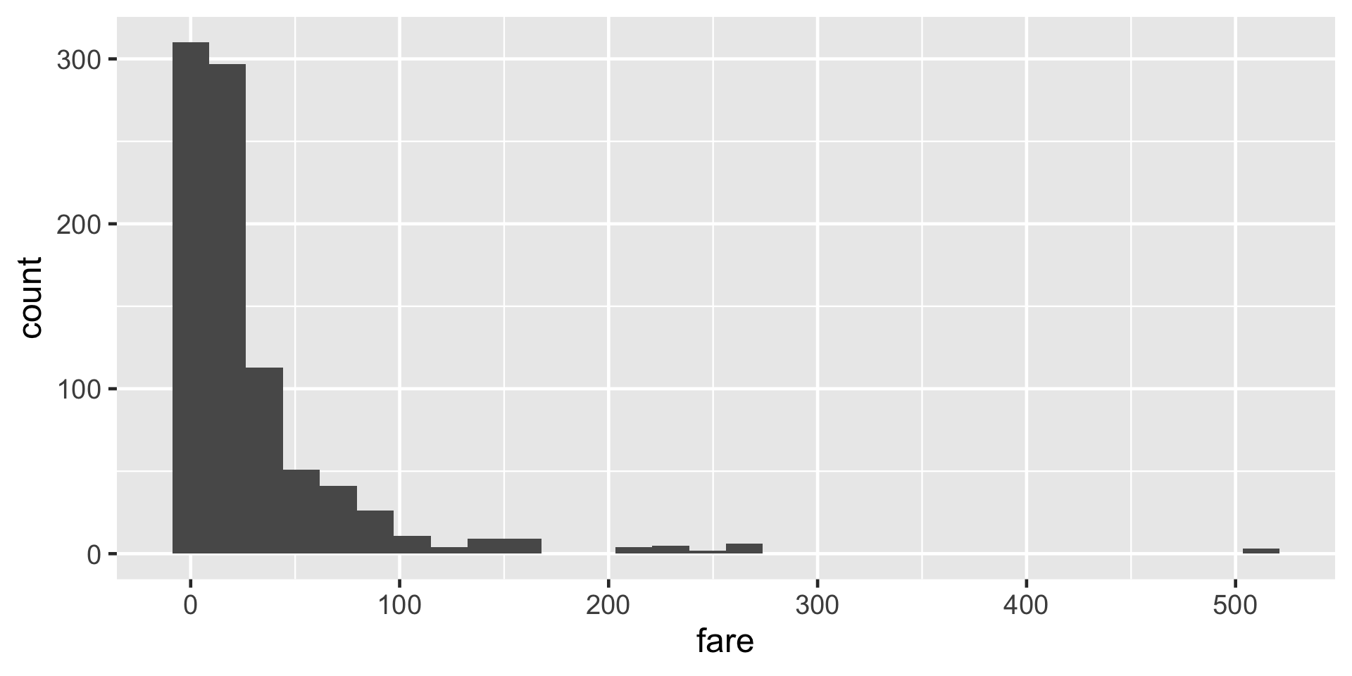

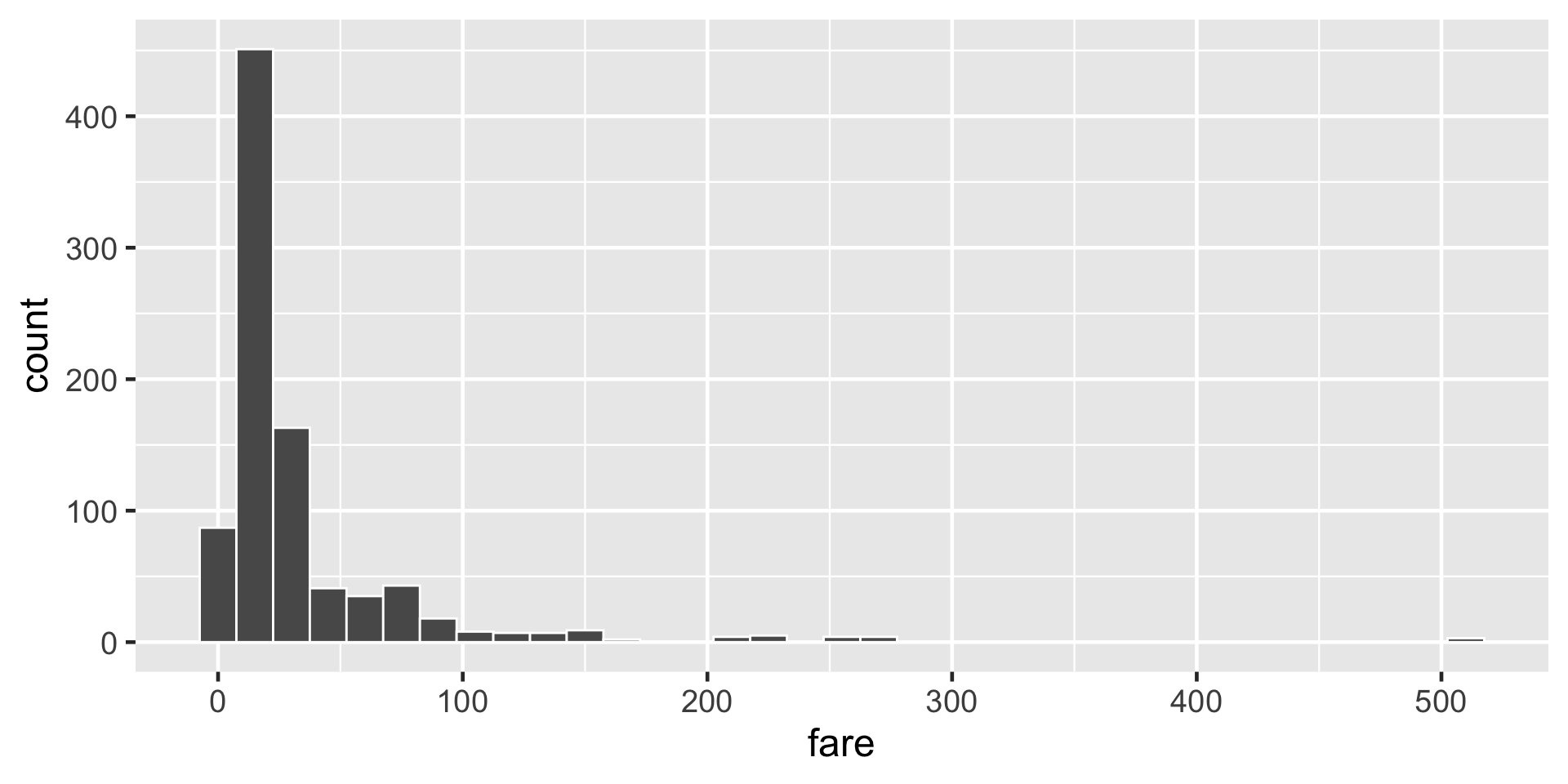
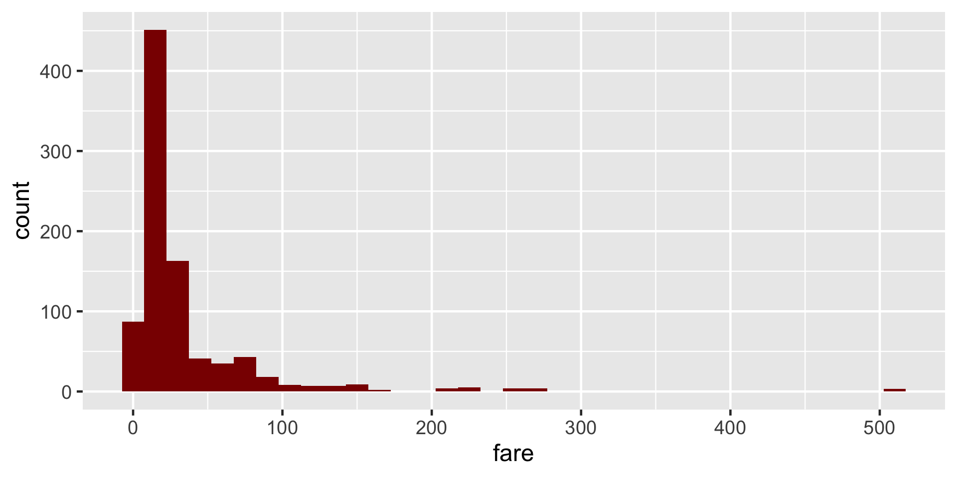
🌈
Pick your favorite color(s) from the list at:
or you can use hex codes.

Visualizing Two Categorical Variables
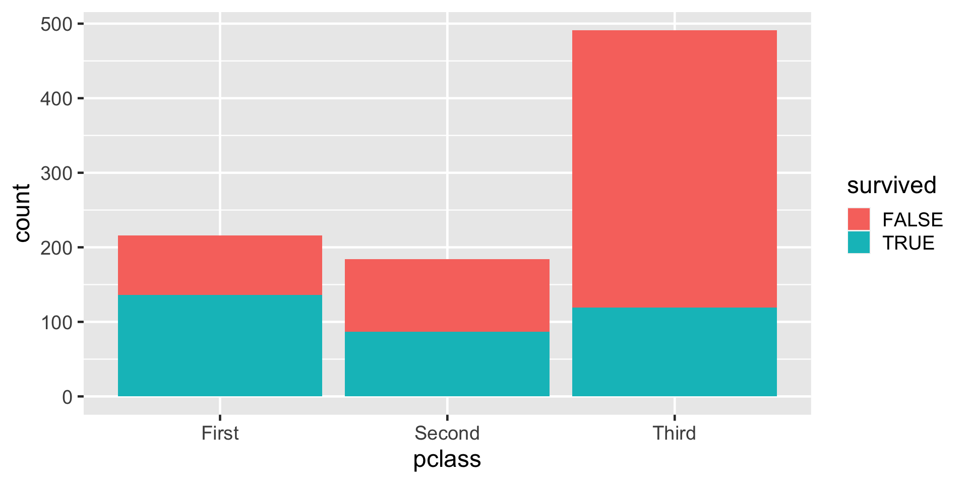
Stacked Bar-Plot
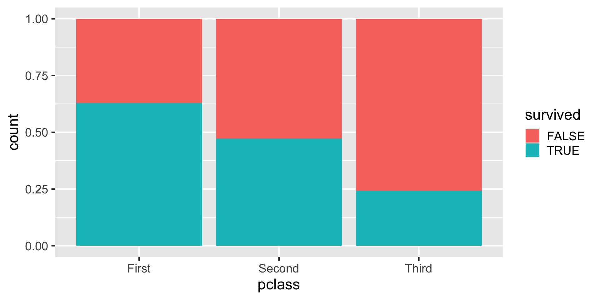
Standardized Bar Plot
Note that y-axis is no longer count but we will learn how to change that later.
New Data

Artwork by @allison_horst
New Data
Rows: 344
Columns: 8
$ species           <fct> Adelie, Adelie, Adelie, Adelie, Adelie, Adelie, Adel…
$ island            <fct> Torgersen, Torgersen, Torgersen, Torgersen, Torgerse…
$ bill_length_mm    <dbl> 39.1, 39.5, 40.3, NA, 36.7, 39.3, 38.9, 39.2, 34.1, …
$ bill_depth_mm     <dbl> 18.7, 17.4, 18.0, NA, 19.3, 20.6, 17.8, 19.6, 18.1, …
$ flipper_length_mm <int> 181, 186, 195, NA, 193, 190, 181, 195, 193, 190, 186…
$ body_mass_g       <int> 3750, 3800, 3250, NA, 3450, 3650, 3625, 4675, 3475, …
$ sex               <fct> male, female, female, NA, female, male, female, male…
$ year              <int> 2007, 2007, 2007, 2007, 2007, 2007, 2007, 2007, 2007…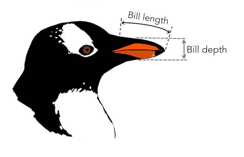
Artwork by @allison_horst
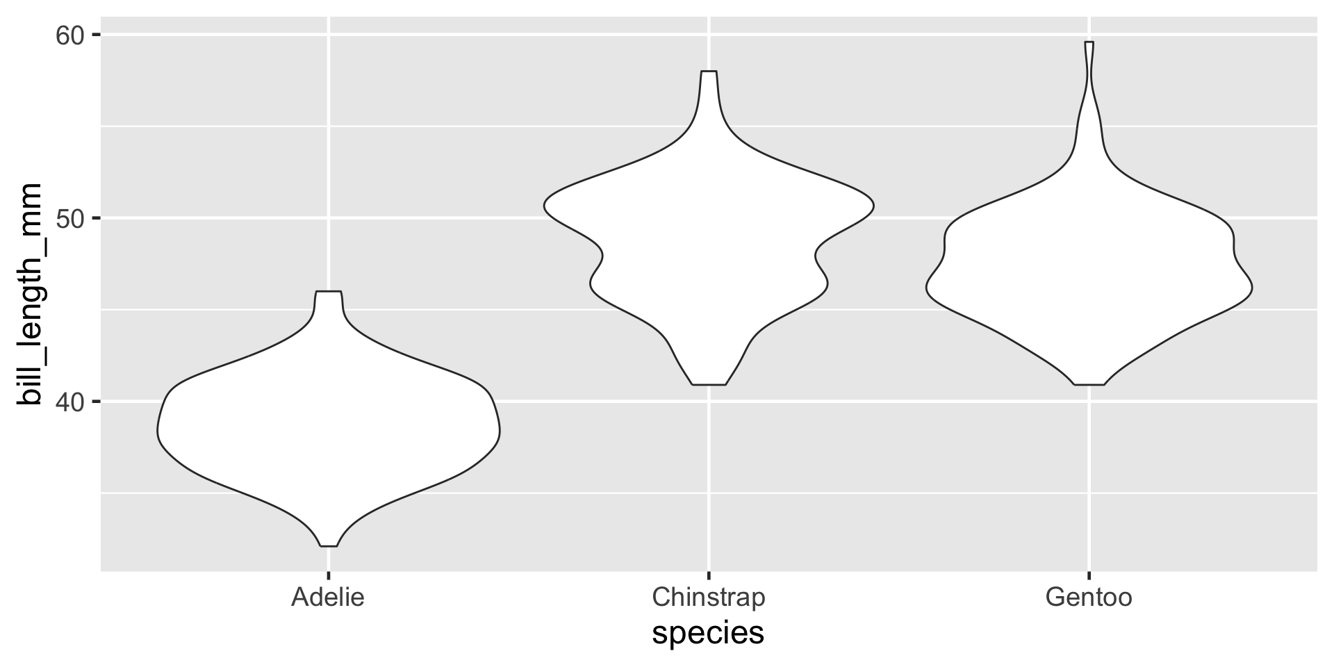
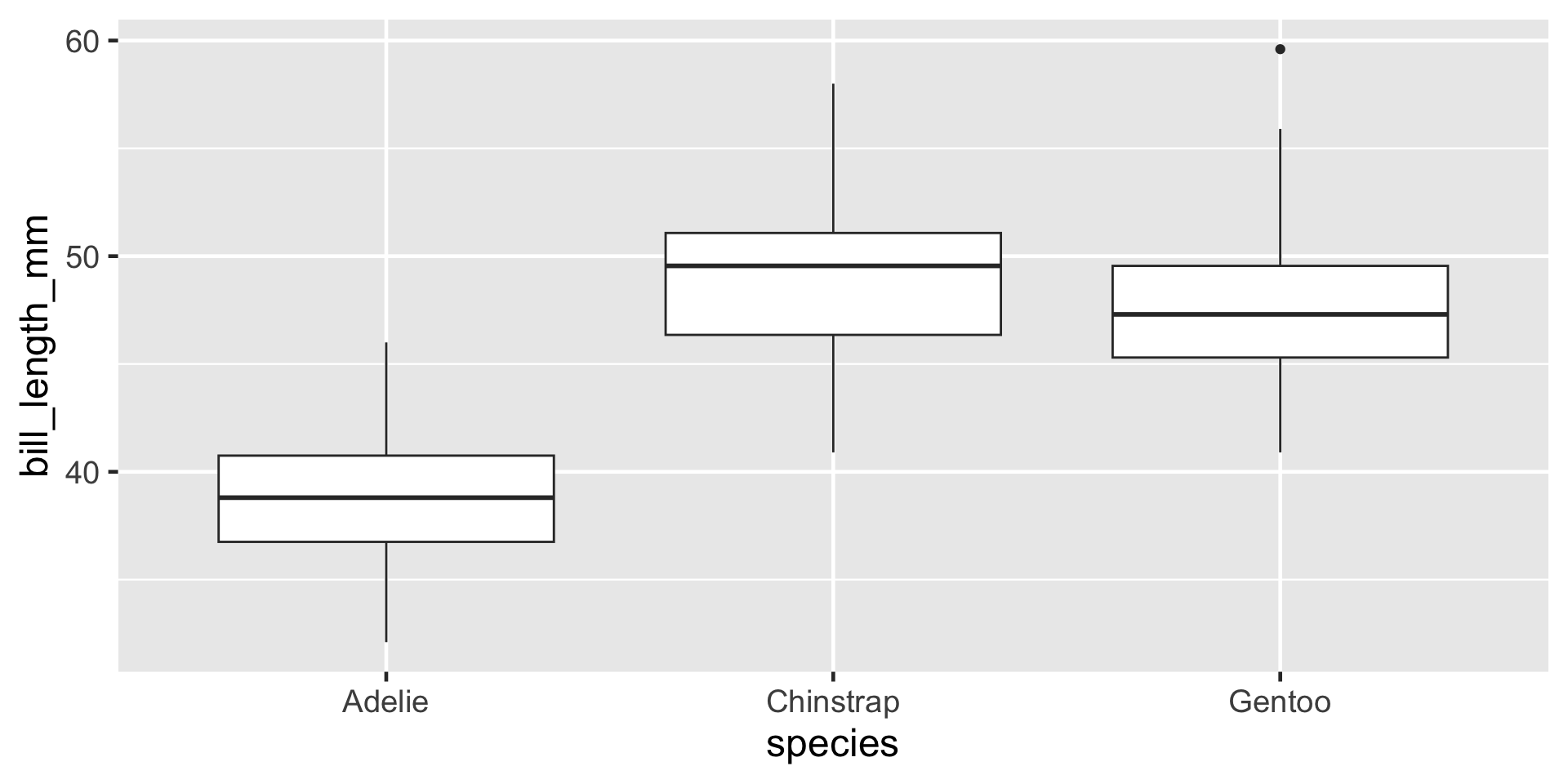
Visualizing a single numerical and single categorical variable
Visualizing a single numerical and single categorical variable
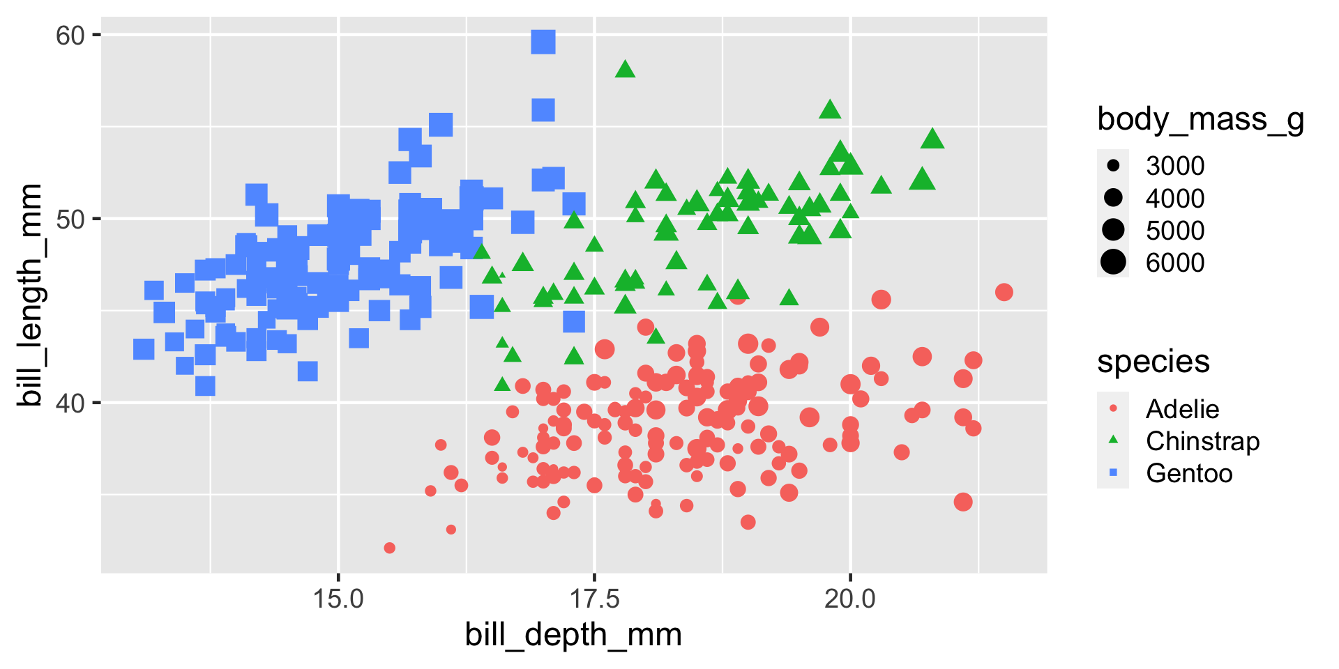
Visualizing Two Numerical Variables
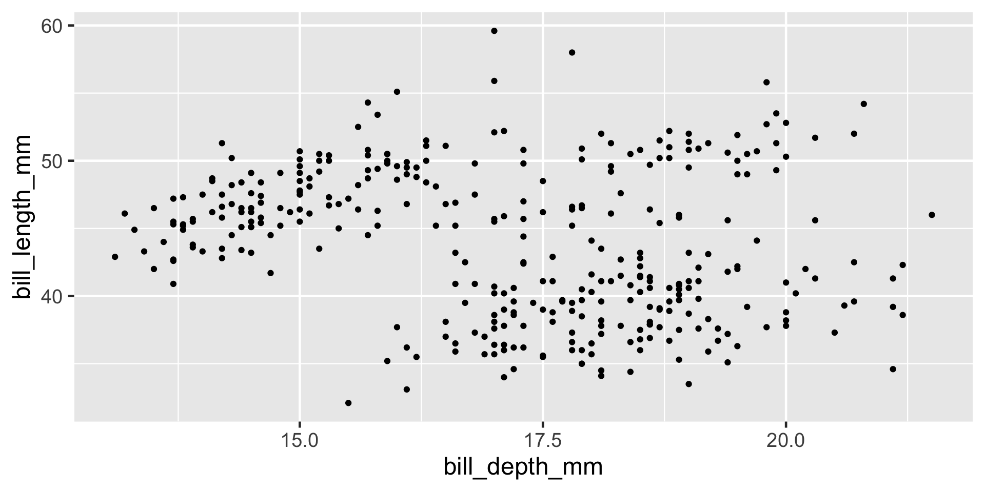
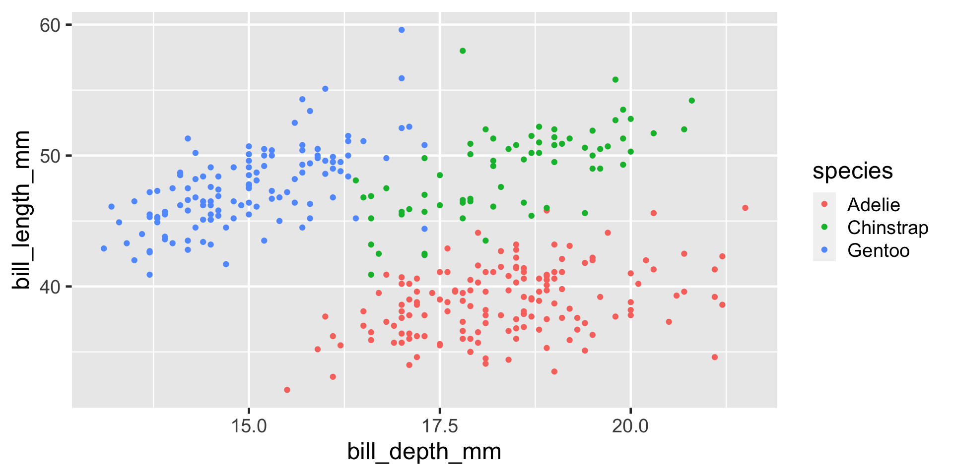
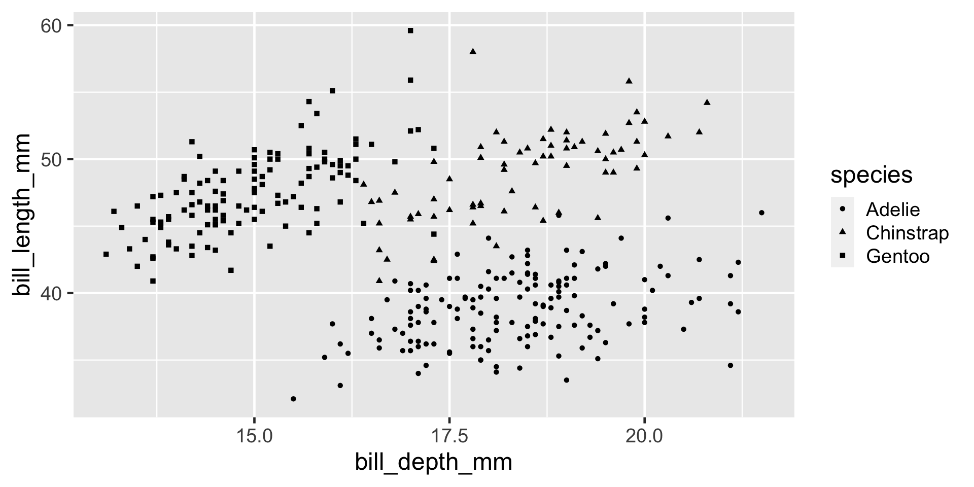
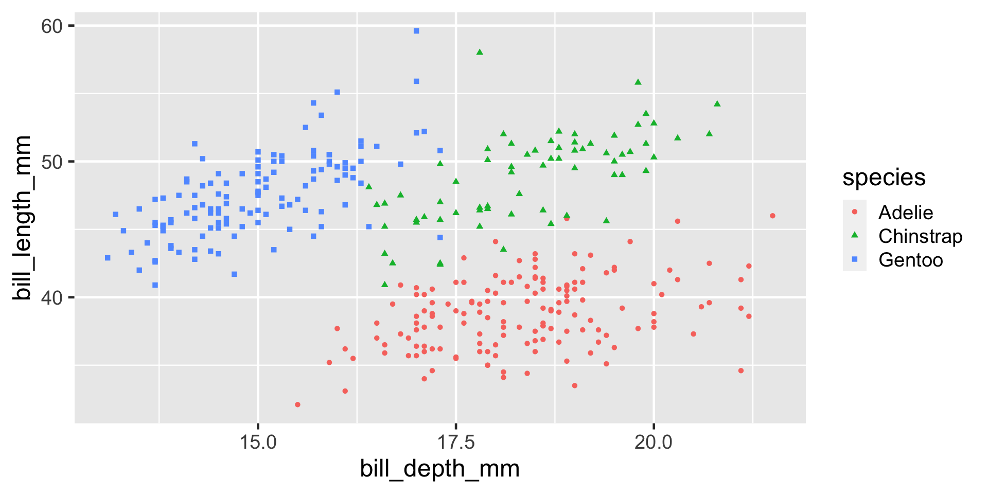
Considering More Than Two Variables
tidyverse style guide
+ should always have a space before it and be followed by a new line.
Further Resources
- the ggplot flipbook
- ggplot2 book
- TidyTuesday and #TidyTuesday on Twitter.
Practice
Using either the babies, titanic or penguins data frame ask a question that you are interested in answering. Visualize data to get a visual answer to the question. What is the visual telling you? Note all of this down in your lecture notes.
